Saturday, September 23, 2023

RSC Back to School Layout

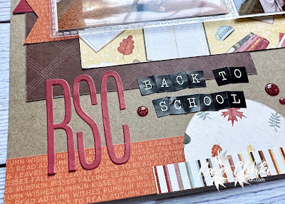
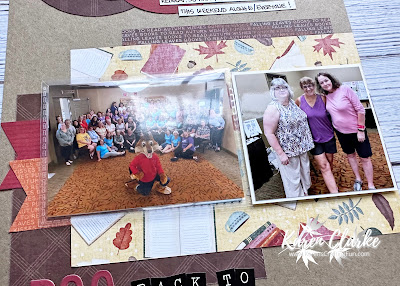
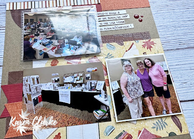
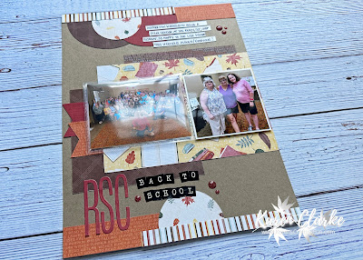
I knew when I saw the book-themed paper from the Cozy Up Collection that I would be using it for this layout. I recently was a Close To My Heart Vendor at the Ready Set Crop Back to School weekend retreat. I had a great time there and was so happy to see everyone I knew and spend some time with my good friends Lisa and Elaine who came from New York for the weekend.


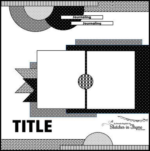
The inspiration for this layout came from this sketch from Sketches in Thyme. You can see this sketch along with others here.


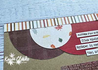
I converted this sketch from 12" x 12" to 8 1/2" x 11" to keep with the other layouts in my family album. I modified the photo sizes as well to work with the new layout size. The title is a combination of die cut letters and some small sticker letters from my stash. I added a Flip Flap to showcase a couple more photos from the weekend. I also added some of the Cozy Up Dots to embellish the layout.


If you are interested in joining me for one of my Scrapbook with me events make sure to Like and Follow my Facebook page to get updates on upcoming events.

I hope you like these layout. Thanks for stopping by!

Supplies list:

X7295S - Cozy Up Paper Pack + Sticker Sheet

X7295C - Cozy Up Coordinating Cardstock

X7295E - Cozy Up Dots
Friday, September 22, 2023

Happy 23rd Birthday

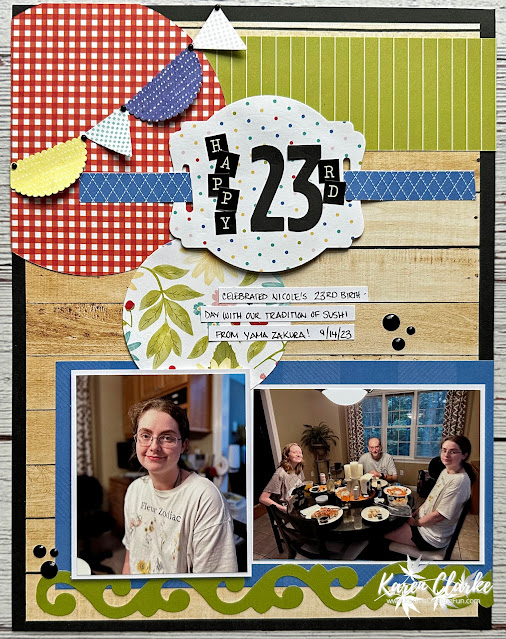
I am having a hard time believing my youngest is now 23 years old! Just just celebrated her birthday recently and we kept it pretty low-key with a dinner from our favorite local sushi restaurant. I had fun creating this layout from the day using up some scraps of the Four Seasons - Summer collection in my stash.


The inspiration for this layout came from this sketch from Scrapbook.com. You can see this sketch along with others here.


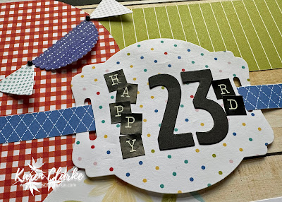
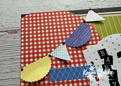
I converted this sketch from 12" x 12" to 8 1/2" x 11" since I am working in this format for most of my projects now. I adjusted the sizing of the photos to work with the 8 1/2" width. I only did the left-hand side of the sketch since I wanted a 1-page layout instead of 2. The flourish border and title label both come from punches in my stash. I changed up the top of the layout to substitute a circle and pennant banner for the flourish. The title is a combination of die cut numbers and letter stickers. I added some enamel dots to embellish the layout.


If you are interested in joining me for one of my Scrapbook with me events make sure to Like and Follow my Facebook page to get updates on upcoming events.

I hope you like these layout. Thanks for stopping by!


Saturday, September 16, 2023

Applefest Layout

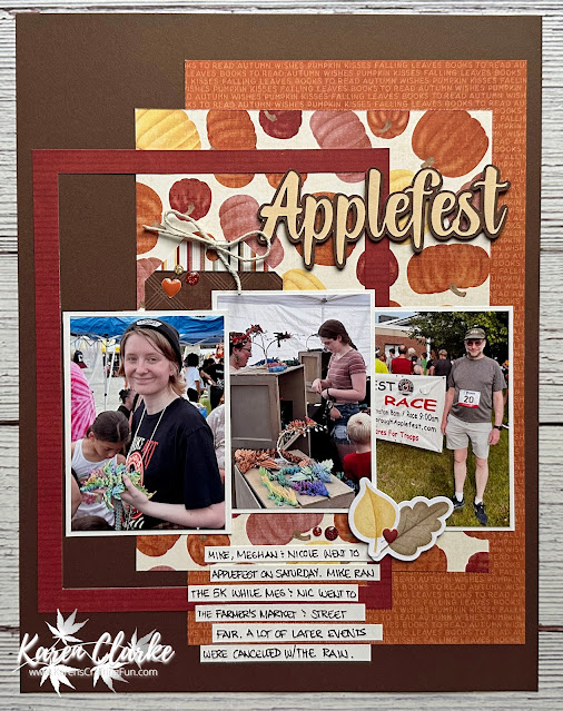
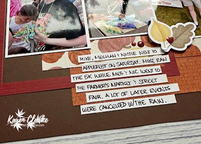
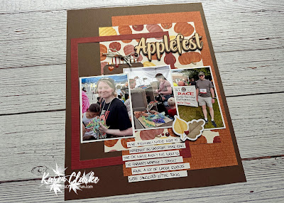
While I was a vendor at a recent scrapbook weekend the rest of my family went to our town's annual Applefest event. There are multiple events during this weekend celebration but due to the rainy weather we had they only got to go to a few of them. I was excited to use papers from the Cozy Up collection for this layout.


The inspiration for this layout came from this sketch from Scrap with Stacy. You can see this sketch along with others here.


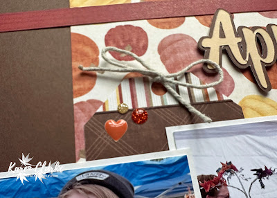
I converted this sketch from 12" x 12" to 8 1/2" x 11" to keep with the other layouts in my family album. I modified the photo sizes as well to work with the new layout size.  The title was cut on my Cricut using a font I had on my computer. I also added an offset to the title to add more dimension to it. I used stickers and enamel dots from the collection to embellish the layout.


If you are interested in joining me for one of my Scrapbook with me events make sure to Like and Follow my Facebook page to get updates on upcoming events.

I hope you like these layout. Thanks for stopping by!

Supplies list:

X7295S - Cozy Up Paper Pack + Sticker Sheet

X7295C - Cozy Up Coordinating Cardstock

X7295E - Cozy Up Dots

Wednesday, September 13, 2023

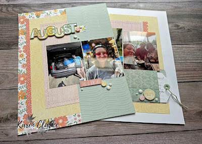
August 2023 Recap Layout

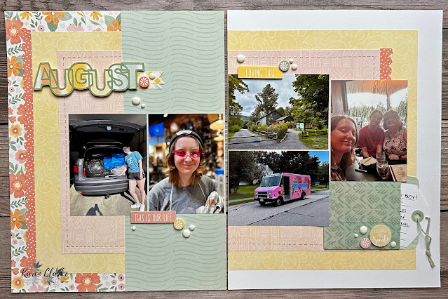
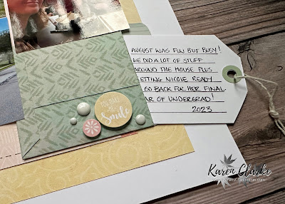
Doing some catching up on my Family Album during this week's Scrapbook with me events. I completed this layout for August as part of my monthly recap series. I used up some of my stash of Memory Lane paper and cardstock for this layout.


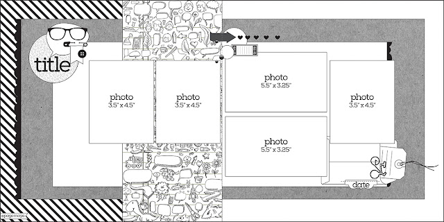
The inspiration for this layout came from this sketch from Scrapbook and Cards Today. You can see this sketch along with others here.


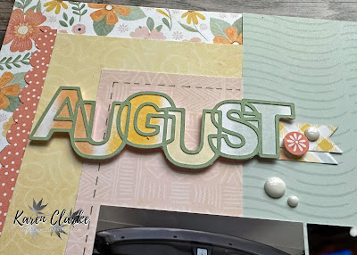
I converted this sketch from 12" x 12" to 8 1/2" x 11" to keep with the other layouts in my family album. I modified the photo sizes as well to work with the new layout size.  The title was cut on my Cricut with an image from an SVG set I have. I created the pocket for the journal tag and cut a slit in the Memory Protector to allow the journal tag to be pulled out. I added some faux-stitching using a grey pen and added some stickers and enamel dots to finish the layout.


If you are interested in joining me for one of my Scrapbook with me events make sure to Like and Follow my Facebook page to get updates on upcoming events.
I hope you like these layout. Thanks for stopping by!

Supplies list:

CC72353 - Memory Lane Paper Packet + Sticker Sheet

CC72355 - Memory Lane Coordinating Cardstock


Friday, September 8, 2023

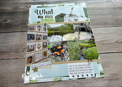
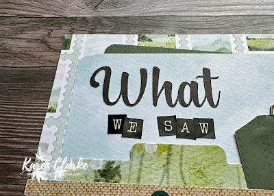
What We Saw Layout

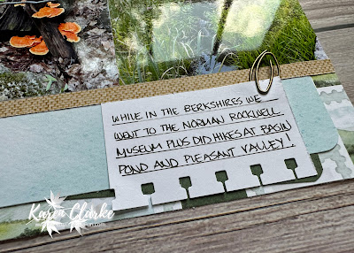
This is the final layout from our weekend in The Berkshires. We went to the Norman Rockwell Museum on Friday and did 2 hikes on Saturday - one at Bassin Pond and the other at the Pleasant Valley Wildlife Preserve. It was such a beautiful weekend that was perfect for being outside!


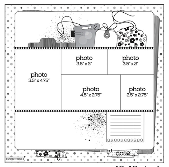
The inspiration for this layout came from this sketch from Page Maps. You can see this sketch along with others here.


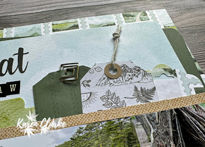
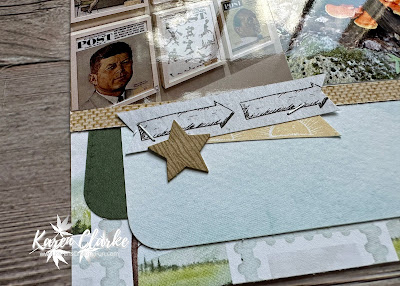
I converted this sketch from 12" x 12" to 8 1/2" x 11" since I am working in this format for most of my projects now. I adjusted the sizing of the photos to work with the 8 1/2" width. The paper comes from the Change of Scenery Workshop kit. The title is a combination of a font cut on my Cricut and some letter stickers from my stash. I added some of the coordinating embellishments from the kit to complete the layout. This layout helped me use up most of the scraps of paper from this kit.


If you are interested in joining me for one of my Scrapbook with me events make sure to Like and Follow my Facebook page to get updates on upcoming events.

I hope you like these layout. Thanks for stopping by!


Friday, September 1, 2023

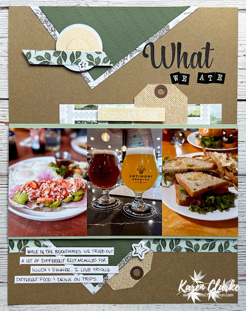
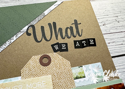
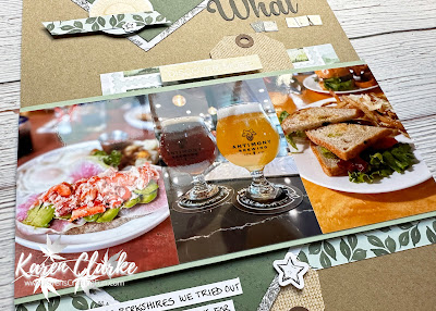
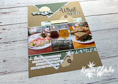
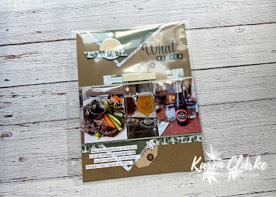
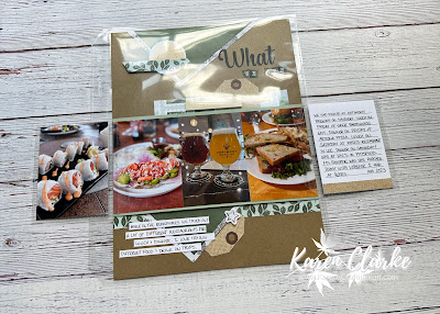
What We Ate Layout

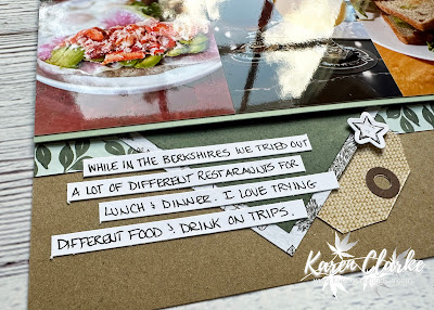
As always when we travel I enjoy trying out different foods and this weekend in the Berkshires was no exception. We had fun checking out the local restaurants for lunch and dinner and definitely enjoyed the food offered. 


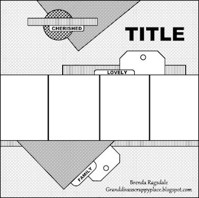
The inspiration for this layout came from this sketch from Scrapbook.com. You can see this sketch along with others here.


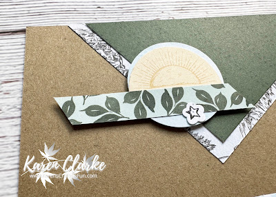
I converted this sketch from 12" x 12" to 8 1/2" x 11" since I am working in this format for most of my projects now. I adjusted the number of photos to work with the 8 1/2" width. I did add some Flip Flaps to this layout as I had a few more photos to scrap. I normally put my Flip Flaps directly on the page and then cut a slit in the Memory Protector to slide it through but with these being so close to the edge I decided to put them on top of the protector. The paper comes from the Change of Scenery Workshop kit. The title is a combination of a font cut on my Cricut and some letter stickers from my stash. I added some of the coordinating embellishments from the kit to complete the layout.


If you are interested in joining me for one of my Scrapbook with me events make sure to Like and Follow my Facebook page to get updates on upcoming events.

I hope you like these layout. Thanks for stopping by!